
Understanding Forex Trading for Nigerian Traders
💱 Understand forex trading: how the global currency market works, key players, methods, risks & rewards for Nigerian traders. Make smarter moves with forex insights today!
Edited By
Isabella Wright
Forex trading can seem like a maze of numbers and jargon, especially to those just entering the market. Visual aids — charts, graphs, and diagrams — help cut through the noise by offering a clearer picture of how currency pairs move. With the naira’s frequent fluctuations and a bustling Nigerian forex community, understanding trade patterns through pictures could make all the difference.
Picture this: a simple line chart showing the movement of the USD/NGN pair over six months. Immediately, you spot peaks and troughs, giving clues on when traders bought or sold. Such visuals translate abstract data into something tangible, refreshing for investors or brokers tired of staring at tables of numbers.
By focusing on image-based learning, traders grasp concepts faster and avoid costly mistakes. Nigerian traders, in particular, benefit from this because accessibility to high-end trading platforms sometimes lags behind. Using screenshots from platforms like MetaTrader or graphs from local fintech services such as Paystack or OPay fills this gap effectively.
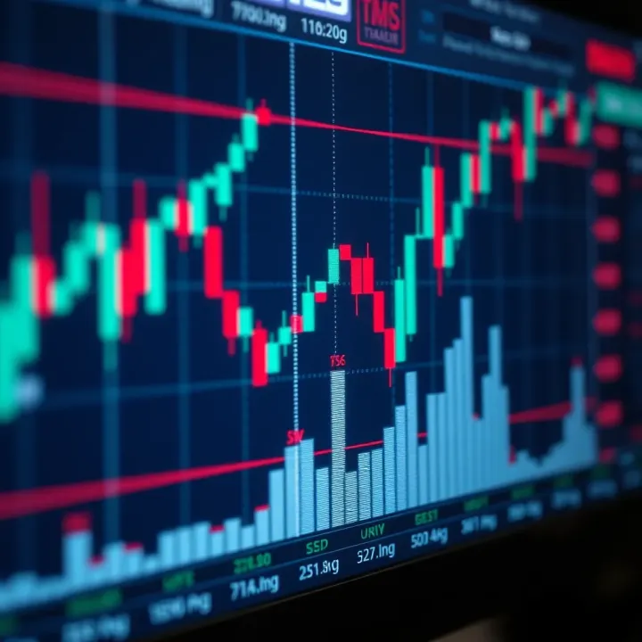
Visual learning enhances pattern recognition. Candlestick charts, for instance, display the opening, closing, high, and low prices within a specific period. To a beginner in Lagos or Abuja, recognising a bullish engulfing pattern on a forex chart can signal a buying opportunity without wading through complicated analysis.
Visuals reduce confusion and boost confidence, empowering traders to make smarter decisions quickly.
Key benefits of using pictures in forex trading include:
Simplifying complex market trends
Highlighting critical entry and exit points
Making risk management clearer
Supporting strategy development
In the upcoming sections, we’ll examine different types of forex charts and teaching images common in the Nigerian forex space. That way, you’ll know not just what to look at, but also how to read what the chart is really saying before investing your hard-earned ₦.
Visuals play a vital role in grasping forex trading, especially because the market’s nature revolves around price movements and trends that charts and diagrams capture clearly. For traders and investors, seeing price action rather than just reading numbers provides immediate, practical insights. Visual aids simplify complex ideas, help recall key patterns, and cater to different ways people learn, making them essential tools in forex education.
Forex trading involves various technical patterns, indicators, and movements that can confuse beginners when explained in words alone. Pictures like candlestick charts or trend lines break down these complexities. For instance, picturing a ‘head and shoulders’ pattern enables a trader to quickly spot potential reversal zones, which might be difficult to describe vividly with text alone. Such visuals give concrete examples that make abstract concepts easier to grasp.
When traders associate a concept with an image, it sticks better in their memory. Seeing a bullish engulfing candlestick pattern repeatedly on charts during study helps embed its significance for future trading decisions. Visual memory aids retention far more than plain text. For Nigerians balancing forex study with tight schedules, a chart image can be a quick refresher that saves time and avoids rereading complicated explanations.
Not everyone learns the same way—some are visual learners, others prefer reading or hands-on practice. Pictures cater particularly well to visual learners by converting numbers and trends into relatable images. For example, a keke napep operator trying forex trading might grasp market momentum better through colour-coded charts than through textual jargon. This accessibility widens who can effectively understand and engage in forex trading.
Some beginners think charts and trading images only beautify trading platforms or books, which makes them ignore the real educational value. But forex visuals are analytical tools, not just decoration. A properly read price chart guides decision-making, much like how a compass guides a traveller. Treating images as mere decoration leads to missing important market signals.
Visuals are windows into market psychology and price action, not just pretty pictures.
A common pitfall is depending solely on charts and patterns without understanding the economic news or macro factors driving price movements. For example, a naïve trader may spot a classic bullish setup on a chart and enter a trade without realising an upcoming Central Bank policy announcement could reverse that trend. Pictures give clues, but understanding the broader context behind those pictures remains crucial to succeed in forex trading.
Grasping the role of visuals alongside fundamentals offers Nigerian traders a balanced approach. It helps avoid getting trapped by misleading patterns while using charts effectively to time trades and manage risks well.
Visual tools play a significant role in forex trading by presenting complex data clearly and enabling traders to make informed decisions. Understanding the key types of forex trading pictures helps you interpret market movements and apply strategies effectively. Each form of visual aid serves a unique purpose in simplifying different aspects of price action, market trends, and momentum.
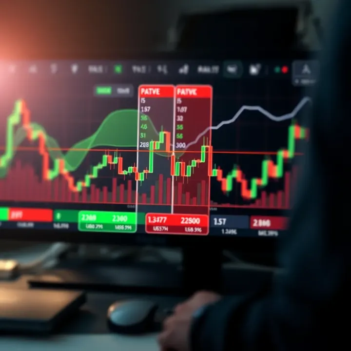
Line charts are the simplest form of price charts, connecting closing prices over time to reveal the overall direction. While they lack detail about intraday movements, line charts are useful for beginner traders or for quickly spotting long-term trends. For example, in the Nigerian market, a trader might use a line chart to check the general trend of the naira against the dollar over several months.
Candlestick charts offer a richer picture by displaying opening, closing, high, and low prices within each period. Traders rely on these charts because the shapes and colours of candlesticks indicate market sentiment—whether buyers or sellers are stronger. Patterns such as bullish engulfing or hammer candlesticks help predict potential reversals or continuation of trends, which is particularly helpful when trading volatile currency pairs like USD/NGN.
Bar charts provide a middle ground between line and candlestick charts. Each bar shows the price range, opening, and closing prices, but unlike candlesticks, bars don't use colour to indicate direction. They are favoured by traders who prefer to focus on price range and volume. For instance, bar charts can help in spotting price consolidation or breakout points during active market hours.
Support and resistance levels mark price points where the market historically struggled to fall below (support) or rise above (resistance). Identifying these levels guides traders in deciding when to enter or exit trades. In the Nigerian context, such levels can reflect reactions to local economic events or CBN policy announcements that influence currency value.
Trend lines and channels help visualise the direction and speed of price movement. Drawing trend lines along lows or highs reveals whether the market is bullish, bearish, or sideways. Channels, formed by parallel trend lines, indicate the range where price fluctuates. Nigerian traders often use these diagrams to recognise when the naira-dollar exchange rate is consolidating or breaking out, aiding timing decisions.
Chart patterns like the head and shoulders or triangle formations offer signals about potential trend reversals or continuations. A head and shoulders pattern, for example, signals a possible bearish reversal after an uptrend. Meanwhile, triangles show periods of market indecision before a breakout. Spotting these patterns allows traders to anticipate market moves rather than merely react.
Moving averages (MAs) smooth out price fluctuations to reveal the underlying trend. Common types include the simple moving average (SMA) and exponential moving average (EMA). Nigerian traders apply MAs to filter out market noise, especially in forex pairs affected by local volatility, helping decide when to buy or sell.
Relative Strength Index (RSI) measures the speed and change of price movements, indicating overbought or oversold conditions. Values above 70 suggest overbought markets ready for a pullback, while below 30 signals oversold conditions that may see a bounce. RSI is handy during volatile periods like ember months when market swings can be sharp.
MACD charts combine moving averages to show momentum changes. The Moving Average Convergence Divergence (MACD) appears as lines and histograms, providing buy or sell signals when lines cross or diverge. Traders use MACD to spot shifts in momentum, reinforcing decisions made with charts and other indicators.
Mastering these key types of forex trading pictures equips you to interpret signals with greater confidence. Using them together creates a fuller understanding of market behaviour, supporting smarter, more disciplined trading.
Understanding forex charts and visuals is central to making informed trading decisions. Without the ability to read these pictures accurately, a trader risks misjudging price movements, leading to losses. Visuals like candlestick charts and pattern diagrams reveal the market's mood and momentum, turning abstract numbers into clear signals. For example, knowing when a bullish trend is taking shape can help you time your entry to maximise profit.
Bullish and bearish candlesticks show whether buyers or sellers control the market. A bullish candlestick, usually shown in green or white, indicates prices closed higher than they opened—buyers dominated during that period. Conversely, a bearish candlestick, often red or black, shows sellers pushed prices lower. This simple colour code helps traders quickly assess short-term sentiment. For instance, a series of bullish candlesticks often suggests an uptrend, which might encourage you to open a long position.
Doji and spinning tops are special candlesticks that signal indecision in the market. A Doji forms when the opening and closing prices are almost equal, implying buyers and sellers are evenly matched. A spinning top has a small body with long wicks, representing uncertainty and potential reversal. When these show up after a strong trend, they often warn of a possible pause or change in direction. For instance, a Doji after a price rally might caution you against entering a trade too early.
Candlestick formations significance lies in patterns made by multiple candles. Formations like the hammer, engulfing, or morning star tell stories about buyer-seller battle outcomes. For example, a hammer formation at the bottom of a downtrend can signal a potential reversal, hinting at a good entry point for long trades. Recognising such patterns allows you to read the market’s intentions beyond individual candlesticks.
Identifying reversal versus continuation patterns is crucial for predicting future price direction. Reversal patterns, such as head and shoulders or double top, suggest the current trend is likely ending. In contrast, continuation patterns like triangles or flags indicate the trend may persist after a brief pause. For instance, spotting a double bottom after a long decline could prepare you to capitalise on a bullish turn. Knowing the difference improves timing and reduces risky guesses.
Recognising false breakouts helps prevent premature trades. False breakouts happen when price moves beyond a support, resistance, or chart pattern level but quickly retreats. Traders often jump in expecting a strong move, only to see prices reverse. For example, in volatile Nigerian markets, spikes caused by news reports or filler liquidity can trick traders. Waiting for confirmation through volume or subsequent candles avoids falling into such traps.
Confirming trends using multiple pictures means combining various chart types and indicators to validate signals. Instead of relying on a single candlestick or pattern, using several pictures, like overlaying moving averages or RSI with price charts, improves reliability. For example, a bullish candlestick pattern supported by rising RSI and a moving average crossover provides stronger evidence of an uptrend. This layered approach is particularly useful when market conditions are uncertain or affected by local economic news.
Mastering how to read and interpret forex pictures empowers you to turn visual data into profitable trading insights, especially within Nigeria’s dynamic forex market.
Using forex trading pictures in actual trading makes it easier to spot opportunities and manage risk effectively. Visual data like charts and indicators offer traders a grounded perspective on price movements, helping turn abstract numbers into concrete signals. This practical approach bridges the gap between theory and hands-on trading, especially for Nigerian traders navigating volatile markets.
Combining charts with risk management is essential for protecting your ₦ capital while aiming for consistent profits. A clear example is using support and resistance levels on a price chart to place stop-loss orders. For instance, if the naira-dollar pair approaches a strong resistance line, setting a stop-loss just below it limits potential losses if the market reverses unexpectedly. This visual cue keeps your trades controlled and avoids reckless bets that deep-pocketed players might exploit.
Using pictures to time entry and exit points sharpens your decision-making in the heat of the market. Candlestick formations like bullish engulfing or hammer signals often suggest a reversal or continuation, guiding when to buy or sell. For example, spotting a bullish engulfing candle near a support zone might encourage you to enter a trade right away, while a shooting star near a resistance could signal it's time to exit. Visual timing helps Nigerian traders avoid missing prime moments due to hesitation or distractions from local market noise.
Avoiding emotional trades through visual signals helps traders stay calm and disciplined. Market swings can trigger fear or greed, but clear chart patterns and indicator confirmations provide objective evidence to back decisions. When visuals indicate a sideways market, it might be wise to wait instead of chasing random moves. Nigerian traders often face sharp naira fluctuations and news shocks; relying on pictures rather than gut feelings keeps trading consistent and reduces costly mistakes.
Trading platforms with built-in charting tools like MetaTrader 4, TradingView, and MT5 offer comprehensive visuals with real-time updates. These platforms allow layering of indicators and drawing trend lines, enabling detailed analysis without switching apps. For Nigerian traders, features such as one-click trade execution and alerts based on chart signals make managing positions much easier amidst daily hustle and frequent power outages.
Mobile apps popular in Nigeria such as MT4 mobile, OANDA, and Pepperstone provide accessible chart viewing on the go. This is vital given Lagos traffic jams and the need to monitor trades during long commutes or at off-hours. Good mobile apps offer offline chart storage, multiple chart types, and tailored notifications so you can respond promptly to market shifts even when network quality fluctuates.
Online resources and tutorial sites like Babypips, Forex Factory, and DailyFX complement trading by offering free chart snapshots, step-by-step guides, and live webinars. These resources help build understanding of complex chart patterns and improve your interpretations. Nigerian traders can combine these lessons with local market insights to develop strategies well suited to the naira’s particular behaviour and economic cycle.
Visual tools are not just decorative—they form the backbone of effective forex trading, aiding Nigerian traders in making informed, timely, and emotion-free decisions to protect and grow their investments.
Visual aids can be a game-changer for Nigerian forex traders when used correctly. The local forex market has its own unique challenges and dynamics, so adapting visual analysis tools to these realities helps traders make smarter decisions and avoid costly mistakes. This section offers practical advice on how to interpret forex pictures within Nigeria’s market context, ensuring that traders use charts and other visuals not just as pretty pictures, but as effective decision-making tools.
The naira's exchange rate swings wildly compared to major currencies like the dollar or euro. When using price charts, Nigerian traders must remember these fluctuations often reflect more than just market sentiment; they include government interventions and foreign exchange shortages. For example, a sudden spike in a USD/NGN chart might not always mean strong dollar demand—it could signal CBN’s policy changes or FX scarcity. Visual analysis needs to account for these realities, so traders shouldn't rely solely on price movement but consider macroeconomic context.
Liquidity varies significantly across trading hours, especially because Nigerian traders mostly operate during local times while forex is global. Markets tend to be less liquid during Nigerian night hours but become more active during UK and US market overlaps. Charts showing volume and price movement during off-peak hours might resemble random noise instead of clear trends. Understanding the rhythm of global forex liquidity helps Nigerian traders interpret charts better, avoiding false signals that come from thin market periods.
Events like CBN policy announcements, petrol subsidy debates, or election outcomes often cause sharp moves visible on forex charts. Nigerian traders who pay attention to such events can anticipate volatility and adjust their strategies accordingly. For instance, just before a major Central Bank rate announcement, price patterns often contract as traders await clarity. Recognising these patterns on charts helps prevent rushed decisions and capitalises on event-driven opportunities.
Forex charts frequently display random price swings called "noise," which can mislead traders into making poor moves. Nigerian market conditions with low liquidity and economic uncertainties add to this noise. Traders must learn to differentiate significant signals from mere market jitters. For example, a small breakout during low volume might be false and quickly reversed. Using indicators like volume or multiple time frame confirmations reduces getting caught by these false moves.
Charts tell one side of the story; Nigerian traders should complement visual analysis with fundamental data such as GDP growth, inflation rates, and FX reserves. For instance, a bullish trend in a USD/NGN chart may contradict weakening naira fundamentals if Nigeria faces dwindling foreign reserves. Blending visuals with economic facts helps provide a fuller picture, reducing reliance on charts alone, which could be misleading in isolation.
Sudden news events cause sharp price spikes or drops visible on trading charts. Nigerian traders must learn to spot these news-driven moves versus normal trends. For example, government announcements regarding fuel subsidy removal can trigger immediate naira depreciation on forex charts. Understanding that such price jumps often reflect reactionary sentiment rather than long-term trends helps traders avoid panic selling or buying, enabling them to plan entries and exits more patiently.
Using visual aids effectively means not just reading charts but understanding the Nigerian market pulse behind those pictures. It equips traders to spot genuine opportunities and steer clear of traps that come with local market quirks.
With these tips, Nigerian forex traders can sharpen their visual analysis skills to navigate the domestic and international forex scene more confidently and profitably.
💱 Understand forex trading: how the global currency market works, key players, methods, risks & rewards for Nigerian traders. Make smarter moves with forex insights today!
📈 Learn how to master pips in forex trading Nigeria! Understand pip values, calculate profits in ₦, and boost your trading strategy for better returns in Nigeria's market.
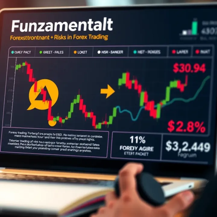
Explore forex trading basics, learn who trades, key terms, methods, and risks involved. Get ready to navigate Nigeria's forex market confidently! 💱
Trading forex in Nigeria? Discover how top forex companies operate, their regulation, tips to spot reliable firms, and ways to avoid common risks 🏦💱
Based on 9 reviews